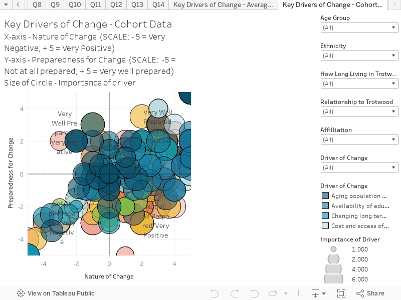
This chart explore the responses based on cohorts. Like in the ‘Key Factor – Average Data’ chart, it combines responses to three questions to create an interactive scatter plot. This visualization shows response data as it relates to all 12 drivers.
The chart is structured as follows:
- X-Axis is the response to the question “Do you think expected changes (over the next 10 years) in each of these drivers, will be positive or negative for Trotwood?” Scale: -5 = Very negative; 0 = Neutral; +5 = Very positive
- Y-Axis is the response to the question “How well prepared is Trotwood to adapt to changes in these drivers?” Scale: -5 = Not at all well prepared; 0 = Neutral; +5 = Very well prepared
- Size of the circle is in response to the question “How important do you think the following drivers will be to Trotwood in 2030?”. Scale: 1 = Not at all important; 10 = Critically Important
- The Cohorts are structured on ‘Age Group’ and ‘Organizational Affiliation’ groupings.
Hover over the circles to reveal extra information on each driver cohort point.