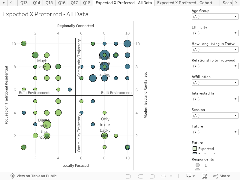
The development of Expected and Preferred Futures ‘Heat-maps’ is a key part of discovering the shared vision. During the survey, people were asked to indicate on a 10 x 10 matrix (overlaying the scenario quadrants), the location of what we call the ‘Expected’ and ‘Preferred’ future.
- The Expected future is in green, and it is where people believe the community will end up if there is ‘no change in what we are currently doing’
- The Preferred future is in blue, and it is what people have identified as the most desired future for the community.
The circles (or dots) represent the number of responses at each point in the matrix. The responses may be further filtered, using the filters’ drop-down menus to the right of the chart. The specific number of responses for each point on the chart may be seen by hovering over the circles within the graph.