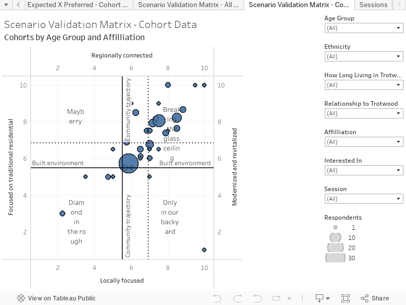
This chart provides a method to validate the preferred future created via the heat maps. This ‘Scenario Matrix Validation Chart’ is created by building a preferred future from the answers to the ‘Important Themes’ questions. These ‘Important Themes’ questions are subsets of the scenario axes, and by recombining each person’s answers we create a unique X, Y average. This approach generates a notional Preferred Future, but one based on likely response to issues and expected behaviour in real-life. This provides a validation of the Preferred Future response based on the heat map diagram.
The circles (or dots) represent the first level of averaging, derived by averaging the responses by primary cohorts (age + length of time in Trotwood). The responses may be further filtered, using the filters’ drop-down menus to the right of the chart. The number of responses for each point on the chart, as well as the cohort details may be seen by hovering over the circles within the graph.