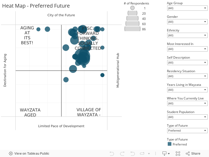
The development of the Preferred Future ‘Heat-map’ is a key part of discovering the shared vision. During the survey, people were asked to indicate on a 10 x 10 matrix (overlaying the scenario quadrants), the location of their ‘Preferred’ future for Wayzata.
The circles (or dots) represent the first level of averaging, derived by averaging the heat map responses by primary cohorts (age, gender etc.). The responses may be further filtered, using the filters’ drop-down menus to the right of the chart. The number of responses for each point on the chart may be seen by hovering over the circles within the graph.