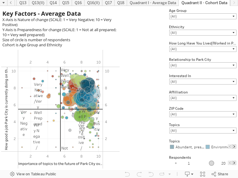
This chart explores the responses based on age and ethnicity. Like in the ‘Key Factor – Average Data’ chart, it combines responses to two questions to create an interactive scatter plot. This visualization shows response data as it relates to all 14 topics. This chart presents the result distribution based on age and ethnicity of Cohorts of respondents.
- X-Axis is the response to the question “How important do you think the following topics will be to Park City over the next 10 years?”. The scale is: 1 = Not Important; 10 = Critically Important
- Y-Axis is the response to the question “How good a job is Park City currently doing on these topics?”. The scale is: 1 = Doing a very poor job; 10 = Doing an excellent job