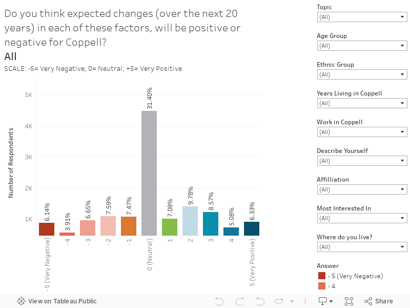
This chart shows how the positive or negative changes in relation to each topic will impact Coppell.
On the chart, there are filters on the right-hand side. These filters allow you to explore responses by different cohorts within the stakeholder respondents. You can also hover over the bar charts to reveal specific information.