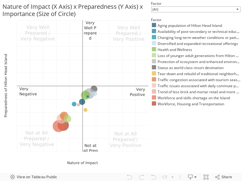
This chart combines responses to three questions to create an interactive scatter plot. This chart presents the average results based on all respondents. The chart is structured as follows:
- X-Axis is the response to the question “How positive or negative do you think the changes will be within each topic area? The scale is from Very Negative to Very Positive
- Y-Axis is the response to the question “How well prepared is Hilton Head Island to adapt to these changes?” The scale is 1-Not at all prepared, 5 –Very well prepared
- Size of the dot is the response to the question “Please indicate how important you think the following topics are to the future of Hilton Head Island” The scale is 1-Not Important, 10 –Critically Important