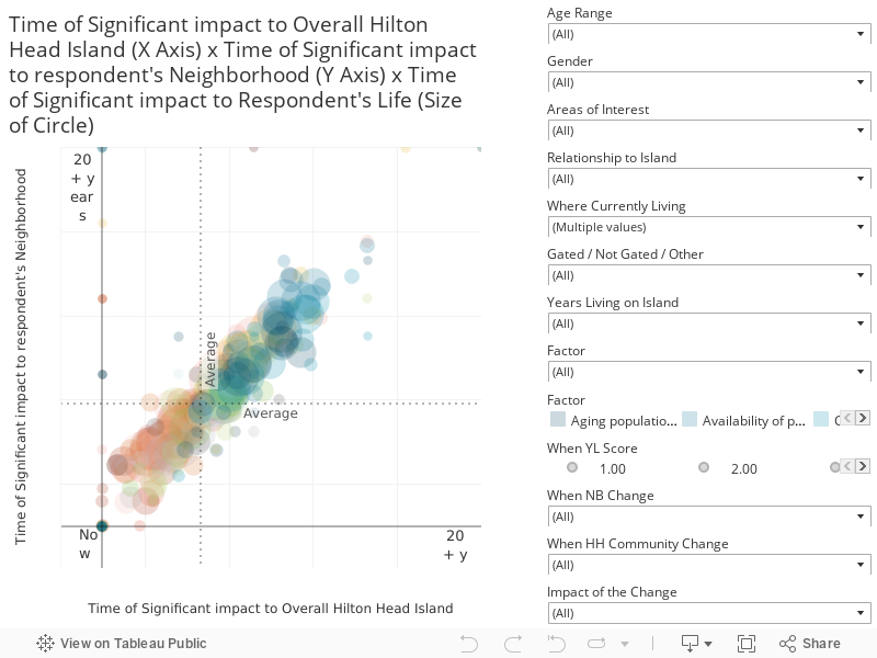
This visualization shows all response data as it relates to all 14 factors, but it is split out into cohorts. This chart presents the result distribution based on all respondents. This chart combines responses to three questions to create an interactive scatter plot. The chart is structured as follows:
- X-Axis is the response to the question “When do you think the following factors will significantly change the overall Hilton Head Island community?” The scale is 1-Now,6-Never.
- Y-Axis is the response to the question “When do you think the following factors will significantly impact the neighborhood(s) where you live or work on Hilton Head Island?” The scale is 1-Now,6-Never.
- Size of the dot is the response to the question “When do you think the following factors will significantly impact your life? The scale is 1-Now,6-Never. The larger the dot, the more immediate the impact.